
Figma
“Collaborative design tool for UX/UI” — a shared workbench where everyone gathers
What Is Figma?
Figma is a collaborative design tool that opens right in your web browser. Several people can work in the same file at once on app and web screen design and prototyping, and hand the result straight to developers.
- 1Multiple people can edit the same screen at the same time
- 2Open it in your browser with nothing to install, and share it with a single link
- 3People who only view and comment join through a much cheaper seat
What sets it apart
These are the differences we found by running the same material through several tools in our training sessions.
Everyone works in the same file at once
No more trading files and ending up with 'final_final2'. Open one link and everyone sees the same screen, even each other’s moving cursors. With only one original at all times, no one has to ask which version is the latest.
Comment directly on the design
Instead of writing "the button on the right of the third screen" in an email, you comment right on that button. People with no design experience can take part, and because the feedback and the fix sit in the same place, the revision history doesn’t get scattered.
Seats are split by role
The official pricing page splits seats into three types: full features, Dev Mode-focused, and view-and-comment. People who only view aren’t charged the full rate, so costs don’t jump when you bring in the whole organization.
⚖️ The weaknesses are clear, too
It takes time to learn. It isn’t a tool you open to make a single poster or a set of social media cards; it’s closer to the workbench of people who design screens for a living. If you only need something quick, Canva is much faster, and keep in mind that every seat adds a monthly fee.
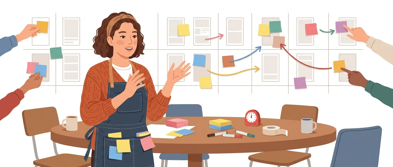
💡 In plain EnglishInstead of everyone drawing at their own desk and merging later, everyone sits around one big workbench and edits the same drawing together.
The costliest waste in building internal systems or apps is 'believing you’ve agreed while looking at different pictures.' Viewing the same screen together and commenting right on it cuts that waste at the source.
Same job, different approach
You need to collect feedback on app screen mockups made by an outside agency
The old way
- Receive mockup files by email and forward them to the team
- Everyone circles things in red on a screenshot and emails it over
- One person compiles the feedback into a single document
- Check one by one whether each item was reflected in the next version
With Figma
- Open the link the contractor sent and share it with your team as is
- Everyone comments right where a fix is needed
- Mark items resolved right where the contractor made the fix
- At the next meeting, review only the open comments
Common uses
Reviewing drafts with contractors and partners
Share the link with the team as is, and leave feedback as comments right on the screen. Feedback lands in one place, with no one needed to compile it.
Designing internal system screens
Sketch internal screens first, such as training sign-ups and electronic approvals, then click through them with the people who will use them to confirm the flow before requesting development.
Managing company templates and master files
Keep master files for templates you reuse, such as presentation decks and event banner specs, in one place, so the look stays consistent even when the person in charge changes.
Who it’s for
Best for
- ✓Anyone who designs app or web screens, or reviews design work
- ✓Planning and marketing managers who often trade mockups with agencies or development teams
- ✓Organizations that want company templates and master design files in one place
Better served by other tools
- –Anyone who just needs a single poster or social media card fast
- –Anyone who can’t spare the time to learn a new tool
- –Solo users who don’t need collaboration features
Can we use it at work?
The questions that adoption leads and security teams ask first.
Note: Check the official terms and the admin console to confirm whether AI features use your data for training, and which settings apply at the organization level.
10-minute quick start
- 1
Sign up at figma.com. There’s nothing to install; it opens right in your browser.
- 2
Don’t start with a blank file. Copy a public UI kit or template and open it.
- 3
Change the text and colors in screens others have made to learn how they’re built.
- 4
Invite a colleague with view and comment permissions and have them leave feedback on the screen.
Copy-and-paste prompts
Replace only the [bracketed] parts, then paste it in.
Please review [screen name]. Leave a comment at each spot where you see a problem, using three criteria: ① an awkward flow ② hard-to-read text ③ missing items. The deadline is [date].
Organize what needs to go to development from this screen. For each screen, add notes with the button names, where each button leads, input rules, and the message to show on error.
These are the presentation formatting rules for [Company Name]. Summarize the heading size, body text size, primary and secondary colors, and margin standards on one page, and place it on the first page of this file.
Place Option A and Option B of the same screen side by side, and add one line under each for its strengths and its concerns. In the meeting, review only these two frames.
Find places where text and background contrast is too low, buttons are too small to tap, and status is shown by color alone. Mark each one with a comment at its location.
Using it with other tools
Linking two or three tools changes your work more than any single tool does.
From idea to development request
Standardizing training material formats
Before you start
- Don’t start from a blank screen. Taking apart templates others have made is a much faster way to learn.
- Check your link-sharing settings. An unreleased screen can leak outside with a single link.
- The wrong seat type wastes money. For people who only view and comment, a lower-tier seat is enough.
- Don't try to make posters with this tool. You'll spend time on work it wasn't built for.
Pricing: personal use and work use
Plans that individuals pay for are different from plans that organizations contract for by member.
For individual use
Unlimited draft files, UI kits and templates, 150 AI credits per day (up to 500 per month)
Access to all products, 3,000 AI credits per month
Dev Mode, FigJam, and Slides; view and comment on designs. 500 AI credits per month
FigJam and Slides, plus view and comment access. 500 AI credits per month
Using it at work
3,500 AI credits per month (full seat)
4,250 AI credits per month (full seats)
Checked 2 Nov 2026 · Monthly per-seat prices (US dollars) shown on Figma's official pricing page. Organization and Enterprise plans are shown with annual billing only, and taxes and currency may vary by country. Prices change without notice — check the official page before you buy. Figma official pricing ↗
Drawbacks of Figma
We don’t just list the positives. Here is what fell short when we used it.
- AI credits run out quickly
Each plan comes with its own AI credits, and a few tries with the new features on the free plan quickly use up the day’s share. You have to count credits rather than experiment freely.
- Slows down with large files
Because it runs in the browser, files with many screens can noticeably slow your laptop. It is also hard to keep working anywhere the internet drops out.
- You end up fixing Korean line breaks
Korean fonts load fine, but line breaks and letter spacing are tuned for Latin text, so Korean sentences wrap awkwardly. The time spent adjusting each slide by hand adds up.
Tools to compare
 StitchDesign workflow tool→
 CanvaVideo and image editing with a large asset library→
 WhimsicalMind maps and visual diagrams→
FAQ
Last updated 22 Sep 2026 · The ratings on this page come from John Kim, CEO of Nanum Consulting, who has used these tools firsthand in training and real work.
Figma, built on your team’s strengths
Send us a message and we’ll reply within 24 hours. We’ll propose a curriculum tailored to your industry and job roles.